Politics and War is created in English, but we offer a translation option to translate the game into your preferred language. Please note that the translation is automatic based on Google's neural translation and not perfect,
but our goal is to make the game as accessible as possible for all players.
Note: This popup will not appear again. If you wish to change your language in the future you will be able to find this language selection option in the website footer or on
the Account Page.
Cookies, Privacy, Terms and Conditions
We care about your privacy. To ensure that you get the best experience, this website uses cookies.
By continuing to use this website, you consent to the use of cookies and agree to the
Privacy Policy and
Terms and Conditions.
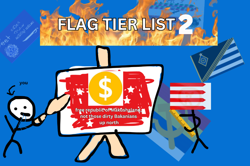
Alright, I'm Rating Flags Again. Who doesn't love meaningless valuation via something you, if you're like me, didn't put much thought into but probably plastered everywhere. First off, I'd like to apologize for giving Hunton the #1 Rank last year, it's a great flag, but in hindsight was outclassed by the Cascadian and Igua Sul Flags. (Speaking of which, neither are still in use.) Secondly, obviously, this is all for entertainment, be nice, its just a joke, be chill if I murder your flag, and you're welcome. This time I'm definitely doing this based on two things:
How objectively cool is it?
Does this make my eyes want to bleed
If the answers are very cool and No, then congrats, you've gotten to Dauchhman approved ranking. Oh, also sorry to Uchama for not covering your improved flag, but I will say its an improvement.
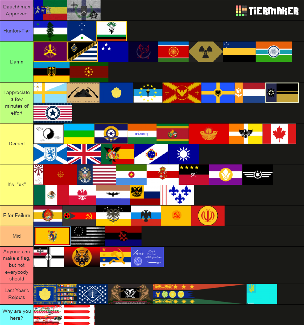
Starting off the from the bottom we have 'Last Year's Rejects', including the horrendously low pixel quality Jangurupurerian and legacy New Olsztyn* flags, followed by RoDevs* mistake with the worst color palette, Froncia's wall of text, and Blue States , "Blue" Flag. Thanks I hate it.
Next, we have this year's mistakes, whatever Kenish is trying to cook isn't working, especially with the watermark at the bottom; Chola has a tiger, which, good for awesomeness, but loses points for the colors and weird fade design. Trito is trying, but I don't think putting a slightly darker shade of yellow over yellow with a giant hammer and sickle is all that appealing, loses points for communism. Somehow even worse than Kenish, Yeetybois takes the cake with honestly what I guess could be AI generated. Godspeed Cascadian Vexillographers.
Not to be outdone by the failures of past and fringe new rp states with questionable flag design, Bedland's old flag misses the mark too, but improves by actually not making me want to tear my eyes out. The design is uninteresting and super dark, but it could be worse, #59, Bedland. Next up is #58, The Atlas, or Dagger PMC, I guess its outdated now, regardless, unoriginal flag with some weird vignette effect that I don't look, followed by a #57 Sino-Venezeulan Empire with no Venezuelan influence, 3 borders for some reason, and a blinding color palette.
Still not out of my path of destruction are #56 The Merchant Republic and #55 Uchama's legacy flag, they're basically inverted but they both feel like they belong on Superman's underpants. #54 The RPSand #53 AFR, Also twins and also kind of inverted, but AFR gets points for not being a total ripoff. Rounding out our Russia wannabes, Melon ends up on the lower tiers again with, what I don't even know how to describe, communist emblem with watermelon seeds and two gray bars which just look ugly, Melon, at #52 you really just need to ditch this for something better. #52, Golden People's Republic, Welcome to Orbis.
Rapid Fire Destruction, #51 Tekkadonia, too Bright, #50 Lazarussia, too airforce-y (this is now a word), #49 Victoria, Baseball logo, #48 Eastorasia, I put you in high tier last year and for that I apologize, too lame, #47 HAE, no, #46, Raritania, what is it with people and eagles, yours is the worst I've seen and its the easiest for me to draw, #45 Ajako, too tall, #44 FSR, too small, #43 Poland, stolen, #42 Mexico, stolen-er, #41 Cameroon, One star is enough, more is worse, #40 Belarus, stolen or half-stolen, either way this coat of arms is mid, #39 Soviet, Really living up to that monarchist communist larp, it's bland.
We've officially entered not mid territory, I like most of these flags but some of them were stolen or just didn't really pop out, either way, your flags look nice. Sorry Meg, at #38 you're at the same level as last year, I encourage you to drop the eagle trend. #37 Scotia, #36 Britain, #35 Tang/RoC, #34 Peru, #33 Canada, #32 Chittagong, and #31 Iberia, please try not to consult Google next time, though, I see why you like them. At #30 and past the halfway mark while not being in a tie, Plata #30 , your flag isn't half bad, I like the premise but I feel like the seal should be bigger and maybe remove the stars, I'm just being picky though. #29 belongs to #29 United Equestrian State, I know this came from DeviantArt but its at least a little bit more unique due to it being from a fandom. #28 Systems Empire is also stolen but looks the best. #27 Valorania has a nice appeal but not much going on, #26 Korea takes the top of Mid-Tier; Really shows how far you can go when your flag isn't first result on image-search. Nice Job.
#25 Kolakia starts out with a good palette but descends from there with the Albanian Eagle. The cross was a good idea, but the circle was not. Might've switched you with Korea but I'm kinda tired and I'd enjoy seeing you two bicker about who really has the better flag; Anyways, Aurelia gets #24, I'd just remove the stars and this would be top 10 material. #23 Novist is kinda hard to see with how dark it is but has an interesting play on the flag of Texas which I quite like. At #22, Ny makes it into the top 33%, congrats, your flag and the sail idea is very cool, a bit bright though. #21 Rocky Mountain Republic gets all the points in awesomeness, but quickly loses them in the fact its so hard to see, The effort means you move up from last year though. #20 Sedrosia proves how far you can go with 2 colors, but unfortunately Eagles are for losers. #19 TUI has too many stars, #18 Netherlands looks great, perhaps a better design of the rose could do, and perhaps a more unique design would earn it more points aswell; That said, good on you for making it to the top 20. Finally, making major improvements across the board, #17, New Olsztyn's new flag actually doesn't look like its from the 16th century, I'd call this the best improvement thus far.
Ok, lets take a break and review these glorious Dauchh Palkian Flags. #16 Dauchh Palkian Flag is a classic, you can recognize it from 100 miles away, representing the greatest nation on Earth, truly just what every great flag should be, mwa. #15, Burger King Foot- #15 The Dauchh Palkian Christmas Flag, which I may or may not have forgotten to turn off for 3 months after Christmas ended. Chaotic fun with tons of RP references and APSA hype, mmm, very good, very good.
Where were we? Oh right, Final 15 Flags, lets go; Actual #15, Luna,great design, but needs more color, :) #14's Nukeya could apply the same, and also gives Mickey Mouse vibes, just kidding its amazing I love you Nukey mwa please dont murder me. #13 Greater India, great design, colors, pretty much perfect except for the re-used seal and I think some of the proportions are off and its bothering me. #12 Tania , I really like the stars circling around the big star but maybe if that were replaced with something more unqique and less, uh, 'geometric', that'd be better, also please turn up the brightness. #11 Winners, we're using the same Indian seal and mostly the same palette, but I like the bright colors and this is just a really good flag template. #10 Southern Germany could get further but its not that original, It's really cool but the weird thin red lines kinda mess it up. #9 Ajako's old flag, The purple and the yellow, and the not being a rectangle, take me back to better times-ish. #8 Cruzerio's flag has also downgraded in my opinion, however it's still very visually appealing, has nice colors and a not-over-the-top emblem. Zukesa's flag is still pretty complicated but perhaps underappreciated by me because it has a very cool an original design that isn't just two bright flashing colors or a sea of darkness. Grats Zukesa on #7. #6 Igua Sul got #2 last time, flawless, kind of wish there was more to look at, but it doesn't really need that. Solid.
#5 We have Legio's Madagascar Flag, Border is obstructive but thats about it, the colors are nice, the seal looks great, its not overly complicated but has a sick emblem and sick colors, good job.
#4 La Punta's Flag is pretty much perfect, as I said last time, maybe make the mountain (white triangle) bigger, but its still neat.
#3 Cascadia's old flag is number 3 again, I only included it because Yeetybois was here, and damn is it great, only thing I would say is to give that green star a white outline (don't know if that's compatible with Esperanto symbolism or whatever but you're not in rp anymore so it doesn't matter!)
#2 Goes to Nova Cyberia, it's original, has a neat and appealing design which is not all that impressive in and off itself but goes the extra mile with Anarchist graffiti that really fits the theme and makes the flag much more notable. Nothing but applause for you.
#1 Vetus Mundus, The BIue, YeIIow, Green Red, Maybe I'm just a sucker for that but I think it looks astounding, the seal is just Iberia's but better, the colors fit perfectly everywhere, I can actually make out the details, the flag isn't stolen, Bravo. I cannot give you anything but the highest, this is the best flag in my not so humble opinion.
Thankyou for reading, if you want to use the template and make your own then use the link at the top, a like is appreciated :)
Yaaaaay thanks for putting me on #13. Would you be willing to do the Union of India flag for fun since it’s a nation? Also I’ll try to fix the proportions thanks for the advice. (I don’t want to change the seal as it is a prominent symbol in Indian history not only used by current India but by previous kingdoms).


Replies
nice
Thank you for the ranking!
Changing my flag to this soon
Why Apolozing?
Keep Me In High Tier Next Time.
Can i be at next tier?
Hope i can be featured next time :)))
It's not a rose tho- it's a tulip
very nice rankings - the green in my flag is for the vast forest terrain, the red and the stars are both for the communist government
Yaaaaay thanks for putting me on #13. Would you be willing to do the Union of India flag for fun since it’s a nation? Also I’ll try to fix the proportions thanks for the advice. (I don’t want to change the seal as it is a prominent symbol in Indian history not only used by current India but by previous kingdoms).
Here it is
I don't mind being the top of mid-tear.